← Back to work

Freelance product design / Audimate / 2022

From a spreadsheet to a useful chart.

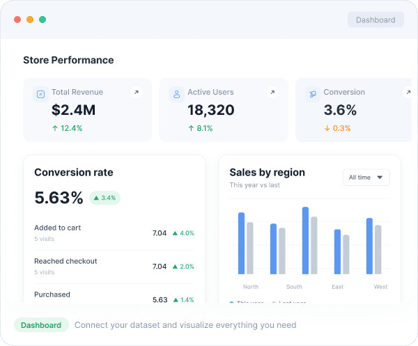
Audimate was a freelance product design project. I designed the path from bringing in a spreadsheet to checking its structure, building a chart, and turning the result into a dashboard.
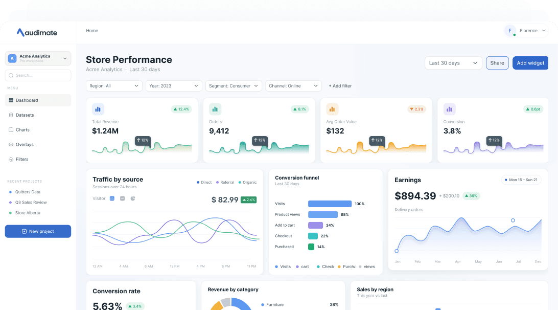
Audimate store-performance dashboard with filters, metrics, charts, a conversion funnel, and regional sales data.
The dashboard was the destination. The file was the real starting point.
Role
Product design, UI, and design system
Engagement
Freelance project
Product
Self-serve analytics product
Year
2022 / expanded 2026

The question behind the brief

How much should someone have to understand before they can see their own data?

I was designing for people who already knew the spreadsheet in front of them. They should not also need to learn a BI tool's language before finding the first answer.

01

Begin with something familiar

A file upload, live source, or sample gives the work a concrete starting point.

02

Show what Audimate understood

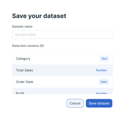
Columns and detected types stay visible before the dataset is saved.

03

Keep cause and effect together

Fields, chart shelves, and the preview stay on the same screen.

04

Make failure recoverable

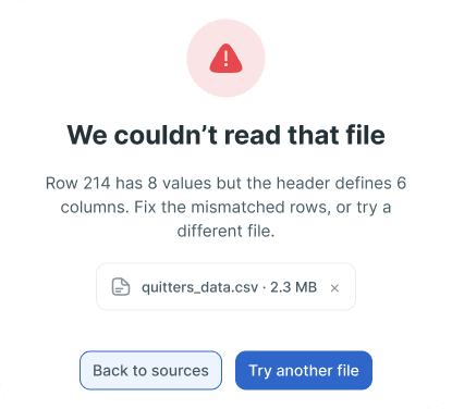
The error names the row, explains the mismatch, and offers a next step.

What I kept returning to

The chart was never the hardest part. The uncertain moment came earlier: did the product read the file correctly, and could the person trust what it found?

Getting started

The first screen asks for data, not chart settings.

A person can upload a file, connect a source, or open sample data. I held back the chart language until Audimate had something concrete to work with.
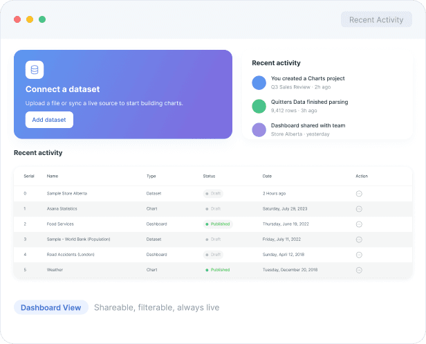
Audimate recent-activity view with a prominent connect-dataset action and project table.
Start with new data or pick up a recent project.
Audimate dashboard view with revenue, active users, conversion, and sales-by-region cards.
The dashboard shows the result before introducing the deeper chart controls.
Audimate connect-a-source option for live databases and warehouses.
Connect a live source for data that changes often.
Audimate use-a-sample option for opening a ready-made dataset.
Try the product with sample data before connecting anything.

File to chart

The import needed its own beginning, middle, and end.

  1. 01Choose a CSV, connect live data, or open a sample
  2. 02See Audimate read the rows and infer column types
  3. 03Check what it found before saving
  4. 04Drag fields into a chart and adjust the result
  5. 05Add the chart to a dashboard and share it

Start

Product state

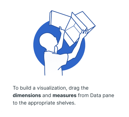
Audimate builder empty state explaining how to drag dimensions and measures into chart shelves.
The empty state points to the shelves and names the two field types.

Parse

Product state

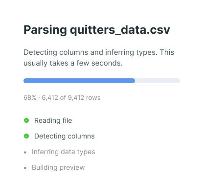
Audimate parsing a CSV file and showing row progress and schema-inference steps.
Progress says what Audimate is checking, not only that it is busy.

Review

Product state

Audimate dataset review showing six detected columns and their inferred data types.
Detected columns and types can be checked before saving.

Fix

Product state

Audimate file error explaining that row 214 has more values than the header defines.
The error names row 214 and explains the column mismatch.

Chart builder

The builder explains itself through position.

Data fields stay left, chart shelves stay in the middle, and the result stays right. Moving a field changes the chart in the same view, so the relationship is easier to follow.
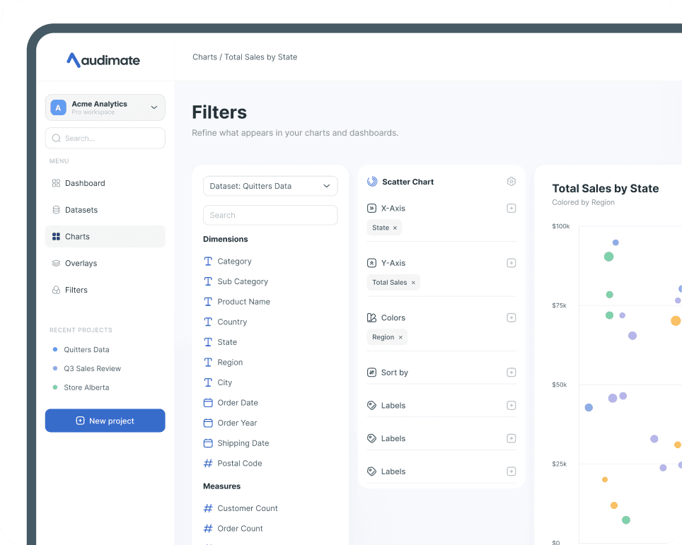
Audimate chart builder with a data pane, chart shelves, filters, and a scatter-plot preview.
Pick a field, place it on the chart, and see the result beside it.

The part I did not want to hide

Dimensions and measures are technical terms, but pretending they do not exist would make the product harder to trust. I kept them visible and let the layout explain how they behave.

Beyond the chart

The project also covered sign-in, data sources, field mapping, settings, and export. The workflow had to hold together beyond a single dashboard.
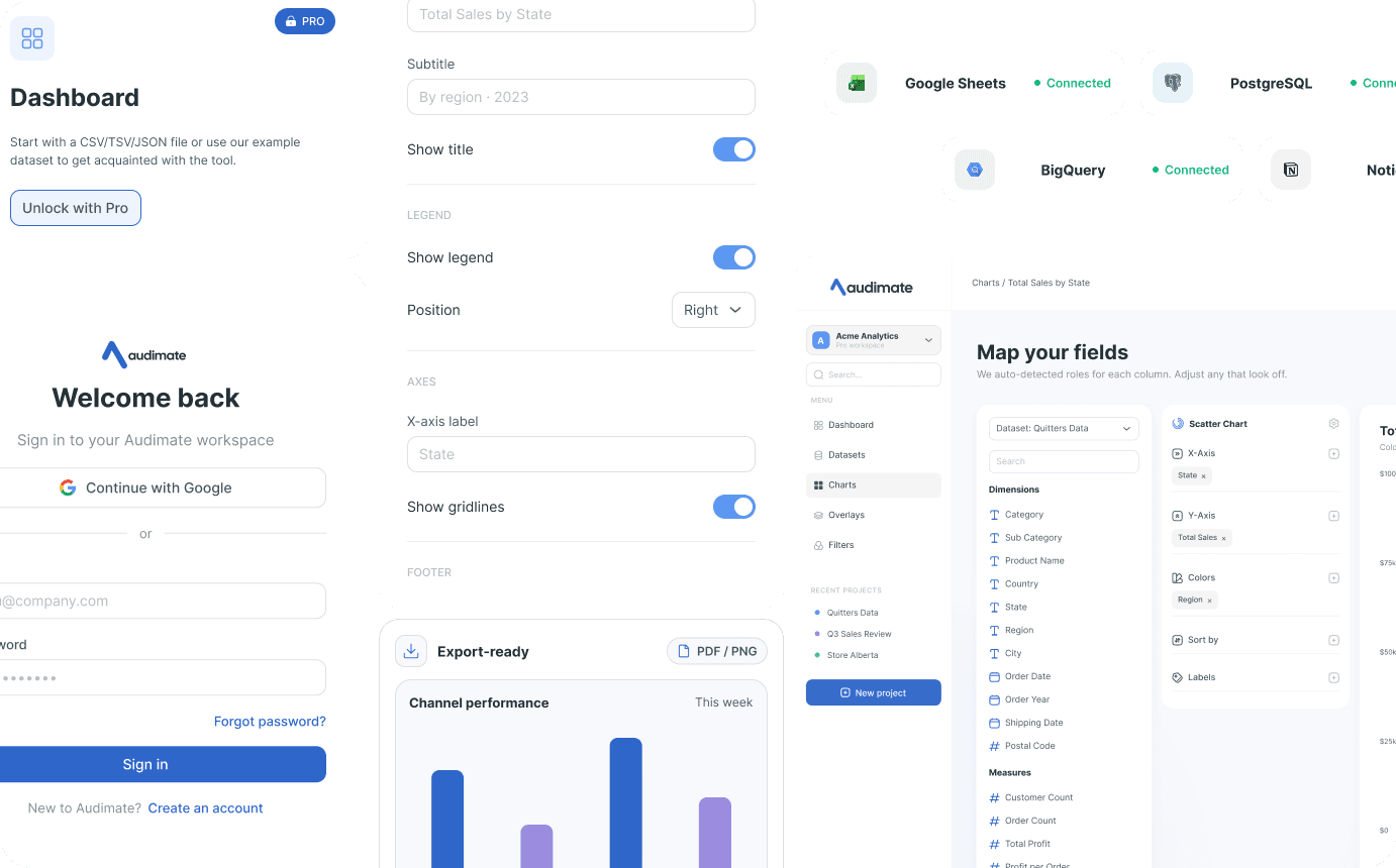
Audimate product collage showing sign-in, dashboard, connected data sources, chart controls, field mapping, and export states.
The same components carry the product from setup to export.

Design system

Returning to the work exposed what the first file was missing.

The original 2022 file was screen-led. When I returned to it for this case study, I rebuilt the foundations and components before extending the product with more states.

Teach through structure

Fields, shelves, and previews stay together, so the builder explains the model while people work.

Keep status visible

Parsing progress, inferred types, saved state, and file errors stay visible. People are not left guessing what happened to their data.

Use one visual language

The dashboard, builder, tables, and public site share the same type, colour, spacing, and control patterns.
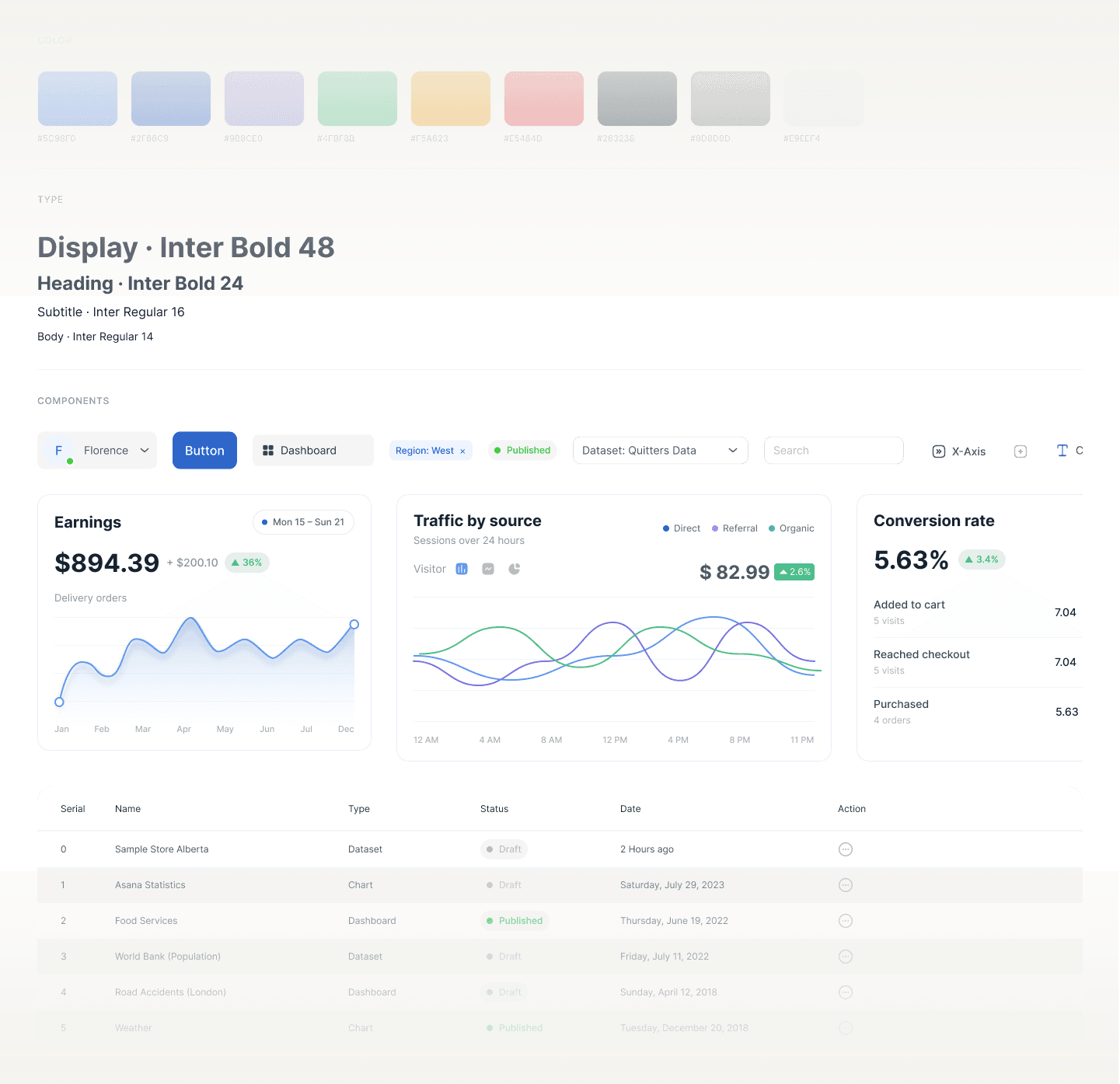
Audimate design system board showing color tokens, typography, controls, chart cards, and data-table rows.
The system behind the dashboard, builder, and tables.

Explaining Audimate

The public story follows the same three steps.

Bring in a spreadsheet. Build a chart. Make a dashboard. I used the same sequence on the landing page because explaining the product should not require a second mental model.

Full Audimate landing page, from product positioning and dashboard proof through workflow steps and the final call to action.
The marketing page follows the same path as the product.
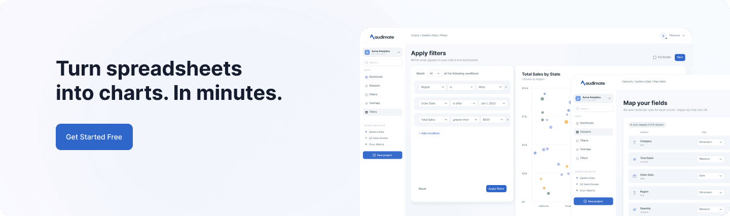
Audimate launch call to action showing filter, chart, and field-mapping product screens.
The final call to action returns to the first step: add your data.

What this case study is

A freelance product design project, revisited with clearer rules.

The 2022 engagement produced the core flow and visual direction. Later case-study work added missing states and system structure. I do not have launch, adoption, or task-time metrics, so I am not presenting them as outcomes.

What I learned

The useful lesson was simple: show people what the product understood before asking them to trust the result.

Back to selected work