← Back to work

Humanity by TCP / shared Android time clock / 2025

A time clock that gets out of the way.

I redesigned Humanity's shared Android clock around a task most people finish in a few seconds. It had to work at arm's length, on a 640 × 360 screen, with whatever punch hardware that clock actually had.
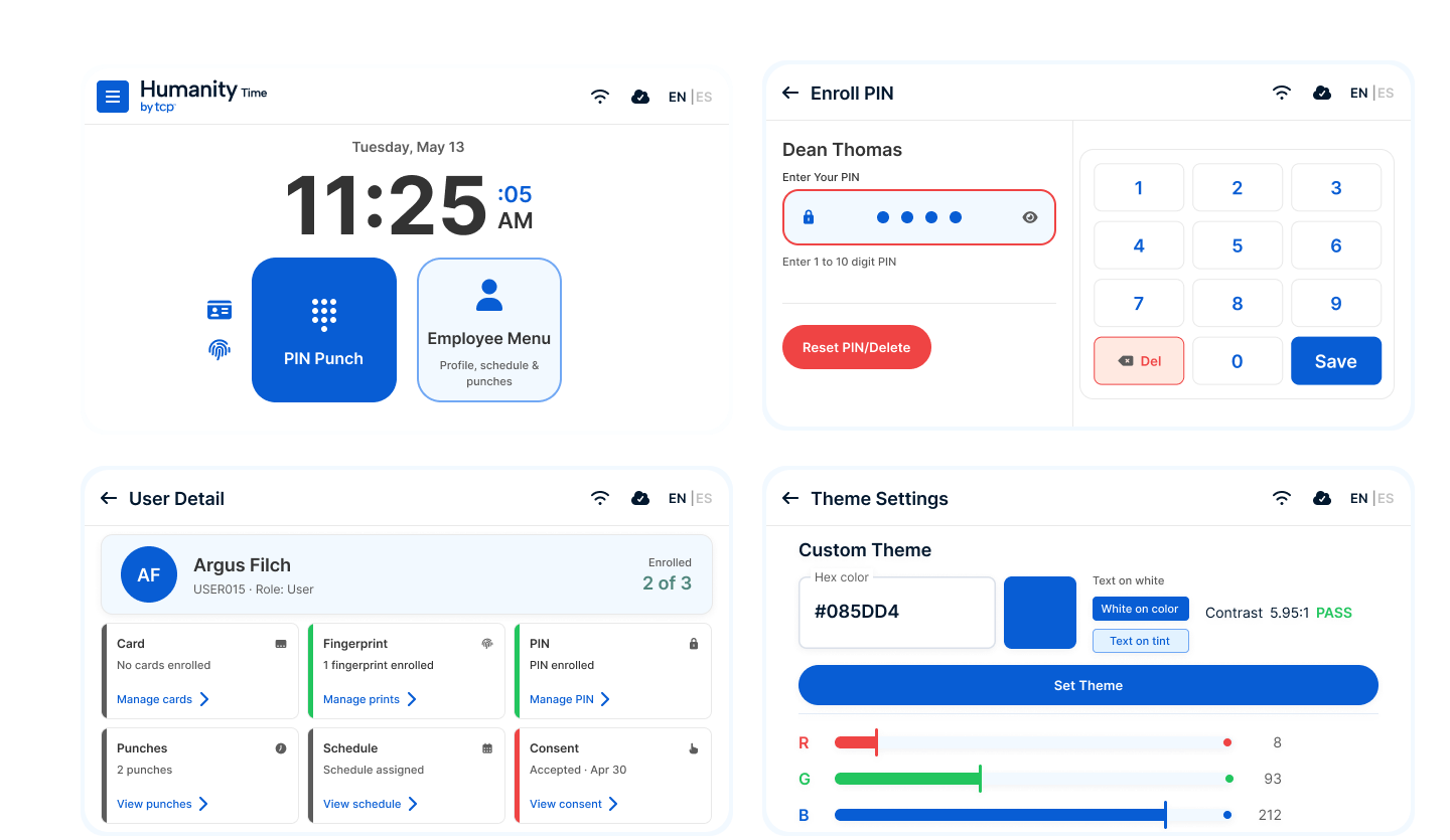
Humanity Time clock terminal system showing dashboard, PIN enrollment, user detail, and theme settings screens.
Four screens from the redesigned Humanity Time terminal.
Role
UX/UI designer, working directly with the Android engineering team.
Engagement
Embedded product system
Platform
Android kiosk · 640×360
Year
2025

The brief I received

Most of the useful detail was hiding in the small notes.

The request looked like a visual cleanup. The notes told a different story. Hardware varied, the app was Kotlin, and the clock needed to recover cleanly after every punch.

01Device

The 5-inch clock does not have a camera.

Facial recognition should never appear on a clock that cannot use it.

02Build

The app is Kotlin. Icons need to become Vector Drawables.

The handoff had to fit the Android pipeline, not stop at a Figma file.

03Rhythm

What happens after a punch or a timeout?

A repeated task needed a deliberate ending and a clean return home.
The first decision

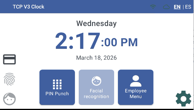
Remove the choice this clock could never complete.

Original Humanity Time home screen showing PIN, fingerprint, facial recognition, and employee menu options.
Before

Every method competed for attention, including facial recognition on a clock with no camera.
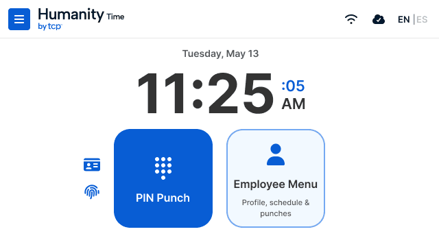
Redesigned Humanity Time home screen leading with PIN and employee menu options.
After

The home screen leads with PIN and only shows punch methods the device can complete.

Clock-in feedback

A clock-in should need one clear answer.

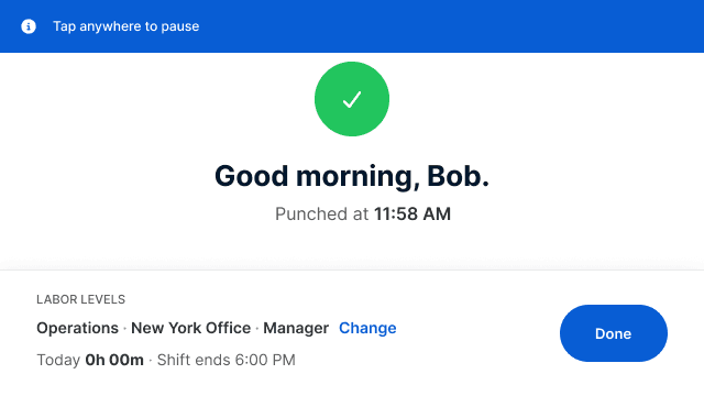
My first confirmation still asked too much of someone already leaving. A greeting, the recorded time, and the next useful action were enough. I pulled the history out and let one message do the job.
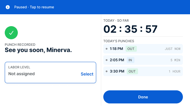
Earlier punch confirmation with a split panel, a message, and a punch log.
Earlier version
  • Two panels compete for attention
  • Too much to read for a repeated task
Redesigned punch confirmation with one large message saying Good morning, Bob.
Revised version
  • One clear confirmation
  • Large enough to read while moving

Core screens

Simple for a worker. Complete for an administrator.

Workers needed speed. Administrators needed depth. I reused the same bars, cards, tables, and status patterns across both so every new screen did not become a fresh invention.
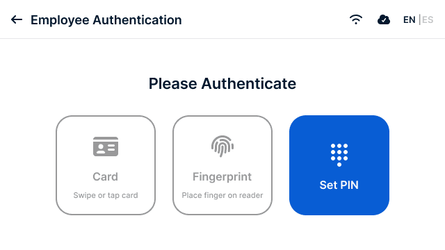
Authentication: the clock only shows the methods supported by that device.
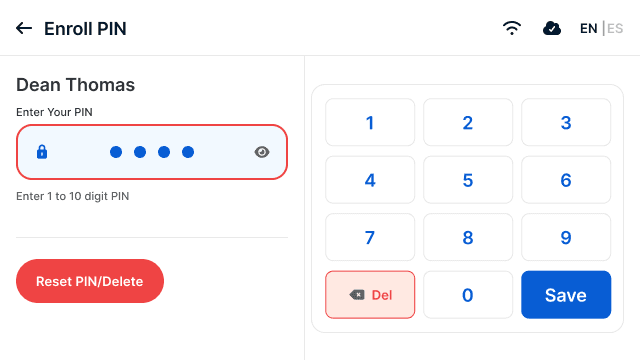
PIN entry: large keys for quick taps and gloved hands.
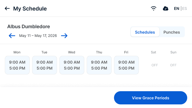
Schedule: a worker can check the week without asking a manager.
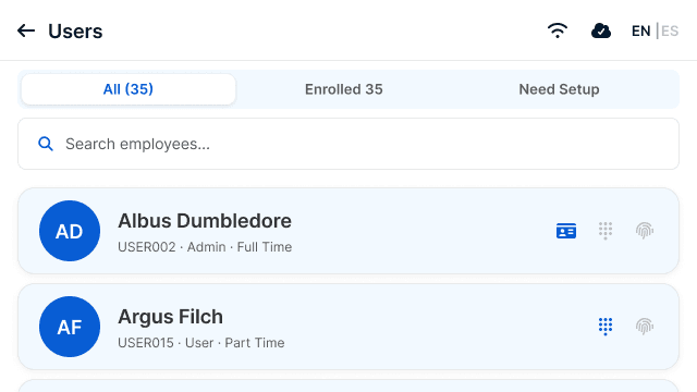
Admin: see each employee's enrolled punch methods at a glance.

One clock, two modes

The employee path stayed shallow. Admin work could go deeper.

A worker could punch, check a schedule, or choose a labor level without entering the admin side. Managers could still reach users, enrollment, history, settings, and device controls.

Main experience
Home, sign-in, and punch-method selection.
Punch flow
Clock-in confirmation, schedules, and labor-level selection.
Admin flow
Users, enrollment, punch history, settings, and theming.
Humanity Time core flows board showing authentication, punch, and admin workflows across nine terminal screens.

Design system

I built the kit beside the product.

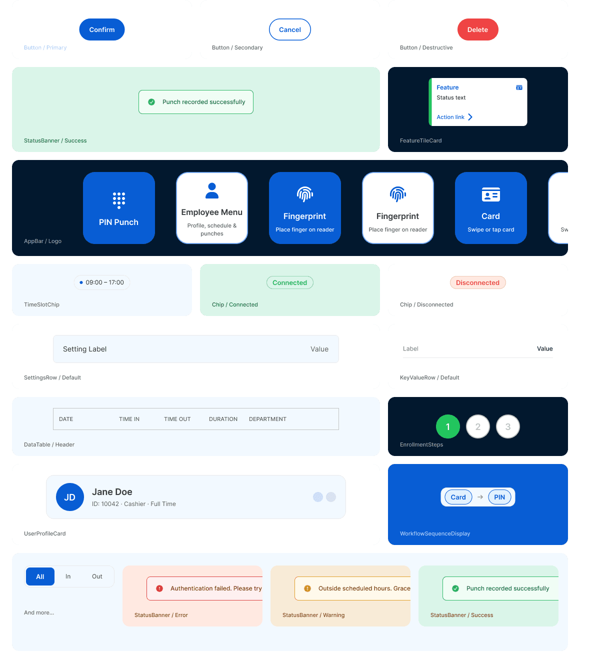
Every screen exposed another piece the Android team would need. I pulled those decisions into one small library as we went, including buttons, auth tiles, tables, status banners, and the PIN pad.

Semantic colour roles

Brand Blue

Primary action

#085DD4

Midnight

Primary text

#02182E

Success

Positive feedback

#22C55E

Error

Blocking states

#EF4444

Warning

Caution

#FEB241

Blue 25

Tint surface

#F2F9FF

Green 50

Success surface

#DAF5E9

Gray 50

Neutral surface

#E9E9E9

Type scale

Clock in, Bob.Heading · H1
22px · Semi Bold
Clock in, Bob.Heading · H2
18px · Semi Bold
Clock in, Bob.Body · Large
14px · Regular
Clock in, Bob.Label · Small
11px · Medium

Core UI components

Core UI component library with buttons, status banners, feature tiles, chips, data rows, and workflow displays.
Buttons, status banners, cards, chips, and data rows used across the terminal.

Theme accessibility

Customers can change the colours without breaking contrast.

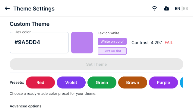
A clock could inherit a customer brand colour. That created an obvious risk: an on-brand clock nobody could read. I made the theme control test contrast before saving and offer safer presets when a colour failed.
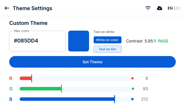
Theme settings showing a colour that passes the contrast check at 5.95 to 1.
5.95:1 pass

Ready to save.

Theme settings showing a colour that fails the contrast check at 4.29 to 1, with save disabled.
4.29:1 fail

Saving blocked. Safer colours shown.

Key decisions

Four rules I kept returning to.

01

One main action per screen.

Workers glance at the clock on their way in or out. Each screen leads with the next action and keeps status easy to read from a distance.

02

Contrast is checked in the product.

Customers can change the theme, but they cannot save a colour that fails the 4.5:1 contrast minimum.

03

Each clock shows what it supports.

Camera options disappear on devices without a camera, so workers never reach a path the hardware cannot complete.

04

Design for the Android build.

I exported icons as Vector Drawables and built components around the way the Kotlin app is structured. This reduced translation during handoff.

What I can stand behind

The handoff is real. The performance numbers are not mine to invent.

I do not have recorded task times or adoption numbers for this work. What I can show is the shipped design and handoff: employee and admin flows, device-aware behavior, contrast rules, and an Android-ready component set.

Product principle

Designed to clock in fast, and get out of the way.

I was not designing a screen people wanted to spend time in. Success meant a worker could trust the answer and leave. That constraint made the work better.

Humanity by TCP · Product design · 2025

Back to selected work